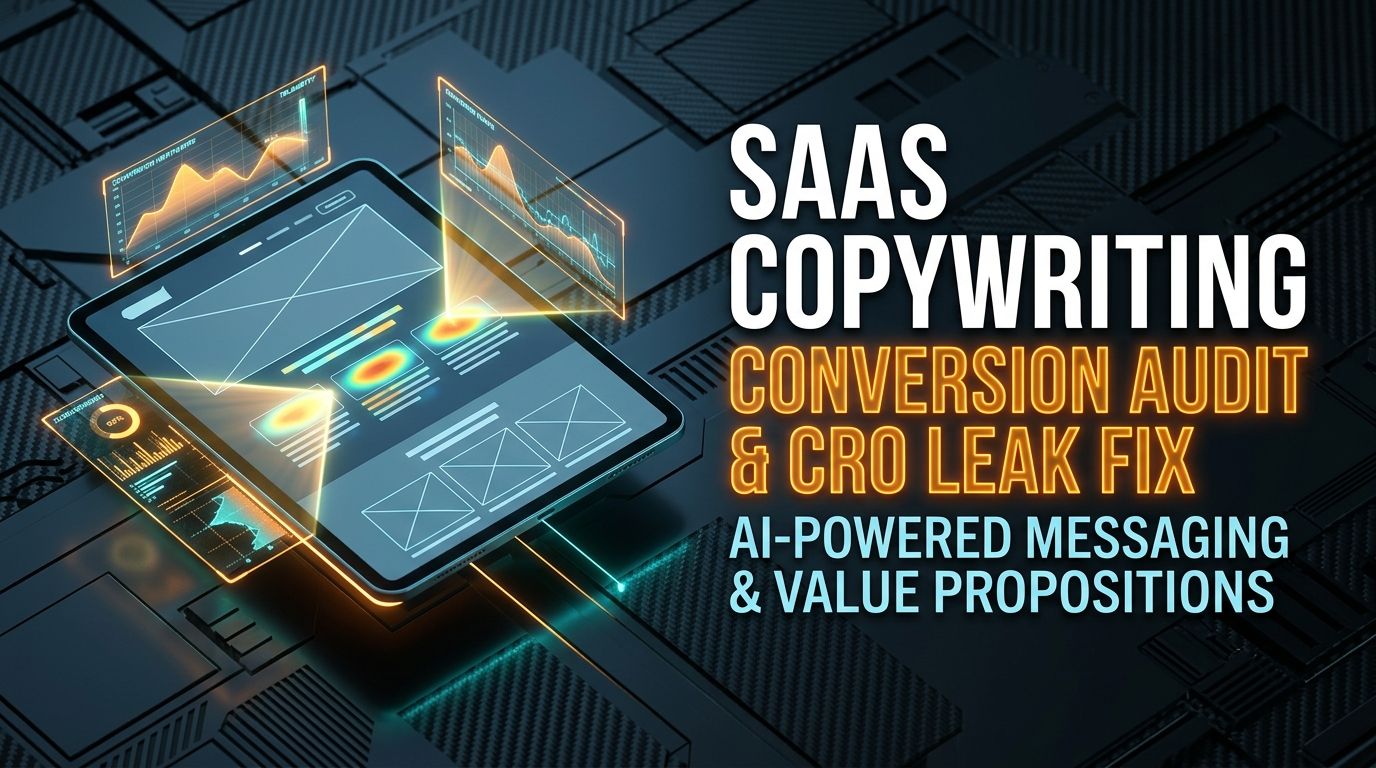
Nine months building something genuinely useful, and then the landing page ships with a headline like "The all-in-one AI platform to empower your team's synergy." That sentence could describe a hundred different products, which means it describes none of them.
You have about four seconds before a visitor decides whether to keep reading or close the tab. If they can't tell what the tool does, who it's for, and what problem it solves in that window, the four seconds are gone and so are they.
Why Technically Great Products Have Bad Landing Pages
Engineers write the product. Someone who understands the architecture but not the buyer writes the page. The result reads like internal documentation: feature lists, not outcomes.
Weak copy: "We support 40+ database connectors"
                 │
                 ▼
Visitor doesn't see themselves in that sentence ──> Tab closed

Strong copy: "Migrate Postgres to Supabase with zero downtime in five minutes"
                 │
                 ▼
Visitor recognizes their exact problem ──> Keeps reading
Auditing Your Own Page in Four Passes
The hero section, first. Does the headline state the outcome without jargon? Is the screenshot your actual product, not an abstract 3D illustration that could be for any SaaS company? Does the CTA say something like "Try Free for 14 Days, No Credit Card" instead of a bare "Get Started"?
The pain, before the pitch. Name the actual bad moment, a database backup failing at 3am, a customer ticket lost in a Slack thread, before you show the fix. Skipping straight to features means the reader never feels the problem you're solving, so the solution doesn't land.
Proof with a number attached. "Great tool! - John" convinces no one. "Cut our monthly AWS database bill by $1,400 within 48 hours of installing this" is specific enough to be believable, and specific enough that a skeptical reader can picture it happening to them.
| Element | What's usually there | What actually converts |
|---|---|---|
| Hero headline | "Revolutionizing Developer Workflows" | "Automate GitHub PR Security Reviews in 60 Seconds" |
| Feature bullet | "Includes advanced vector database search" | "Find relevant customer tickets instantly, even with typos" |
| CTA button | "Submit" | "Generate My Free Architecture Audit →" |
What AI Is Actually Good For Here
An AI audit works well for finding the gap between what your copy claims and what real users actually complain about, feed it support tickets and review text alongside your landing page, and it'll surface friction language you'd never write yourself because you're too close to the product. What it shouldn't do is write the final copy unsupervised. A founder who actually knows the product needs to check that every claim is technically accurate before it ships.
Frequently Asked Questions
Can AI write the whole landing page without a human touching it?
It shouldn't. AI is strong at auditing existing copy against proven frameworks and proposing alternatives, but a founder needs to verify every technical claim before it goes live, since an AI-generated claim that's slightly wrong is worse than a boring but accurate one.
How long should a SaaS landing page actually be?
For self-serve tools in the ten to fifty dollar a month range, keep it tight, four hundred to seven hundred words. For enterprise contracts running a thousand dollars a month or more, buyers expect more depth on security, compliance, and onboarding, so twelve hundred to two thousand words is reasonable.
What's the fastest way to find where a page is actually losing people?
Run a heatmap or scroll-depth tool alongside the copy audit. If most visitors never scroll past the hero, the problem is there, not in the pricing table three screens down that nobody's reading anyway.


Comments
Comments are reviewed before appearing publicly.
No comments yet — be the first.