The Drift of Arbitrary CSS: Why AI-Generated Frontend Code Degrades
AI frontend generators produce functional React and Vue components fast, but they routinely litter the codebase with hardcoded arbitrary values: w-[342px], bg-[#002244], p-[17px], z-[9999]. One of these looks harmless in a diff. A codebase with forty of them has quietly lost visual consistency, and some of those one-off values will fail WCAG contrast math without ever looking obviously wrong on screen, that's exactly what makes them easy to ship and hard to catch in a normal design review.
Frontend hygiene matters: clean, tokenized architectures load faster, stay visually consistent, and hold up to keyboard and screen reader navigation without special-casing.
The 4 Pillars of Frontend Token & A11y Remediation
1. Design Token Normalization
Every arbitrary class should map cleanly back to the project's token scale (Tailwind theme or CSS custom properties):
p-[17px]→p-4(16px) orp-5(20px)bg-[#00ADFB]→bg-primaryorbg-blue-500rounded-[14px]→rounded-xl
2. The WCAG 2.1 AA Contrast Standard
Contrast has to be checked with real numbers, not by eye:
- Normal text (< 24px): minimum 4.5:1 contrast ratio against the background.
- Large text (≥ 24px, or ≥ 14pt / 18.66px bold): minimum 3.0:1.
- UI components, borders, and icons: minimum 3.0:1 against adjacent colors.
3. The 8-State Interactive Styling Matrix
Every interactive component, buttons, tabs, inputs, needs explicit styling for all eight states below, without suppressing keyboard focus:
| Interactive State | Tailwind / ARIA Implementation |
|---|---|
| Hover | hover:bg-primary-hover |
| Active / Press | active:bg-primary-active |
| Focus Visible | focus-visible:ring-2 focus-visible:ring-primary focus-visible:outline-none |
| Focus Within | focus-within:ring-2 (for form containers) |
| Disabled | disabled:opacity-50 disabled:cursor-not-allowed |
| Selected | aria-selected:bg-accent |
| Expanded | aria-expanded:rotate-180 |
| Loading | disabled={isLoading} with a spinning SVG indicator |
Focus-visible is the one that quietly breaks keyboard navigation when it's missing, and it's also the one least likely to get caught in review, since almost nobody tabs through a UI to test it.
4. Semantic HTML First
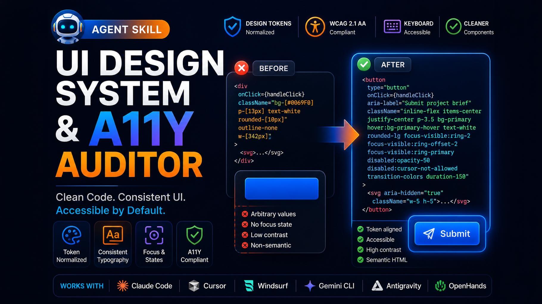
Replace non-semantic <div onClick={...}> with native <button> elements:
// Accessible, token-aligned, native Tailwind 3+
<button
  type="button"
  onClick={handleClick}
  aria-label="Submit project brief"
  aria-busy={isLoading}
  disabled={isDisabled || isLoading}
  className="inline-flex items-center justify-center p-3.5 bg-primary hover:bg-primary-hover active:bg-primary-active text-white rounded-lg focus-visible:ring-2 focus-visible:ring-offset-2 focus-visible:ring-primary focus-visible:outline-none transition-colors duration-150 disabled:opacity-50 disabled:cursor-not-allowed"
>
  {isLoading ? (
    <span className="inline-block w-5 h-5 border-2 border-white/30 border-t-white rounded-full animate-spin" aria-hidden="true" />
  ) : (
    <svg aria-hidden="true" className="w-5 h-5">...</svg>
  )}
</button>
The aria-busy={isLoading} attribute above is required, not optional: a purely visual spinner (aria-hidden) announces nothing to screen reader users on its own, so the busy state must also be exposed on the button element itself.
Automating UI & A11y Audits with Agent Skills
The UI Design System & A11y Auditor skill inspects your components and returns a scorecard of eliminated arbitrary brackets and accessibility score gains:
"Using the ui-design-system-auditor skill, audit my component library in src/components. Normalize all arbitrary Tailwind classes and remediate WCAG 2.1 AA contrast and focus states."
Frequently Asked Questions
Why are arbitrary Tailwind values (like p-[17px]) problematic?
Arbitrary values bypass design system token constraints, leading to inconsistent visual spacing, typography drift, and bloated CSS bundles across large codebases.
What is the minimum WCAG 2.1 AA contrast requirement?
WCAG 2.1 AA requires a minimum 4.5:1 contrast ratio for normal text (<24px), 3.0:1 for large text (≥24px or ≥18.66px bold), and 3.0:1 for essential UI components and icons.
Why should clickable <div> elements be replaced with <button>?
Native <button> elements provide built-in keyboard focus management, Tab navigation, and Enter/Spacebar activation required by assistive technologies.

Comments
Comments are reviewed before appearing publicly.
No comments yet — be the first.